Improving Hybrid Workflows: A UX Redesign for ROL.iO, a Smart Office Platform
Project Type
UX/UI Design
UX Research
Branding
Role
UX/UI Designer
UX Researcher
Duration
Jan - Jun 2023
Tools
Adobe XD
Lucidchart
Project Overview
ROL Intelligent Office (ROL.iO) is an all-in-one workplace experience platform that connects employees with workpoints, resources, and colleagues in a hybrid environment. It also enables organizations to make data-driven decisions about office usage, hybrid work patterns, and resource efficiency. The product was first released in 2019 and has evolved significantly since. I contributed to the redesign of core UX flows and the overall design system.
Use Group: Hybrid office workers
Project goal: Improve flows for booking resources, managing bookings, and connecting with colleagues—while providing organizations with clearer, actionable insights on office/resource usage.
App Analysis & User Research
I began by analyzing the existing user flows and UI components to identify redundancies, inconsistencies, and missing elements. I also conducted five user interviews to gather feedback on the current application.

I analyzed all components and functionalities across every view on existing application
What Was Not Working
Users were unsure which floor they were viewing because the location information was hidden in the navigation bar.
Booking a resource felt slow and required too many steps.
Users struggled to scan availability across resources.
What was working
Users interacted well with the map—viewing resource status and starting bookings from the map felt natural
Managing bookings was generally straightforward.
Filters helped users find specific resources with the right equipment.
Key Research Findings
User behaviour
Many bookings happen spontaneously and on the spot.
Users often use the app to locate a resource or a colleague.
Implications for design
Booking needs to be fast and simple.
Visibility of location and floor is crucial, especially for users unfamiliar with the office.
Resource status must be easy to skim.
UX Design
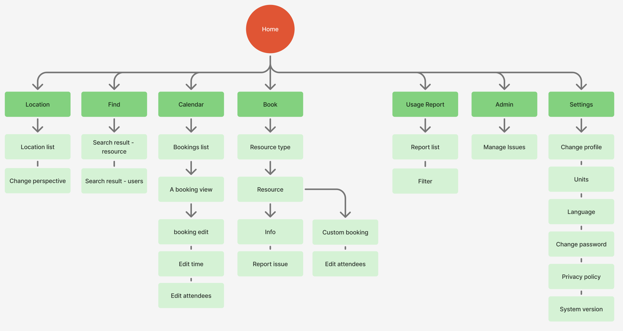
1. Information Architecture
Based on the research insights, I redesigned the information architecture and user flows. I started with a site map to structure how navigation categories connect to each other and to clarify the content within each section
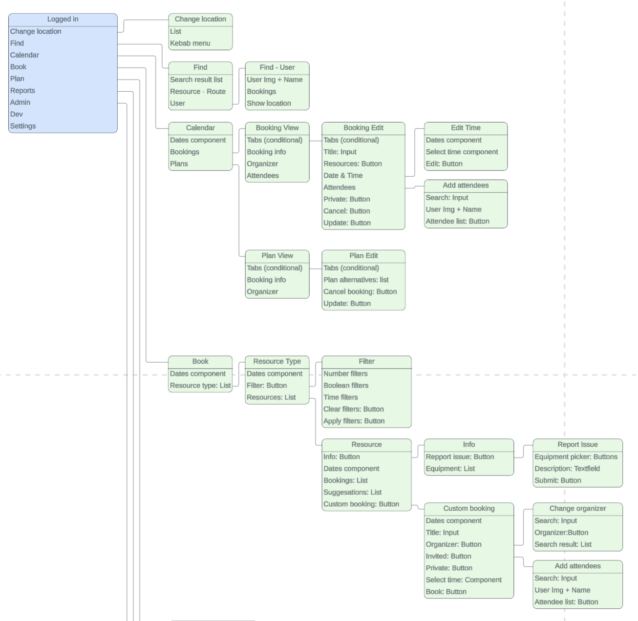
2. Component Mapping
I mapped UI components to every screen. This clarified what actions the user can take in each view and helped developers interpret the design with fewer ambiguities.
UI Design
Status Colors for Better Legibility
Previously, all resource icons used the same color, making availability hard to scan. I introduced red, yellow, and green filled status styles to allow users to identify availability at a glance. These bright status colors were paired with soft pastel UI colors to ensure clarity without visual noise.

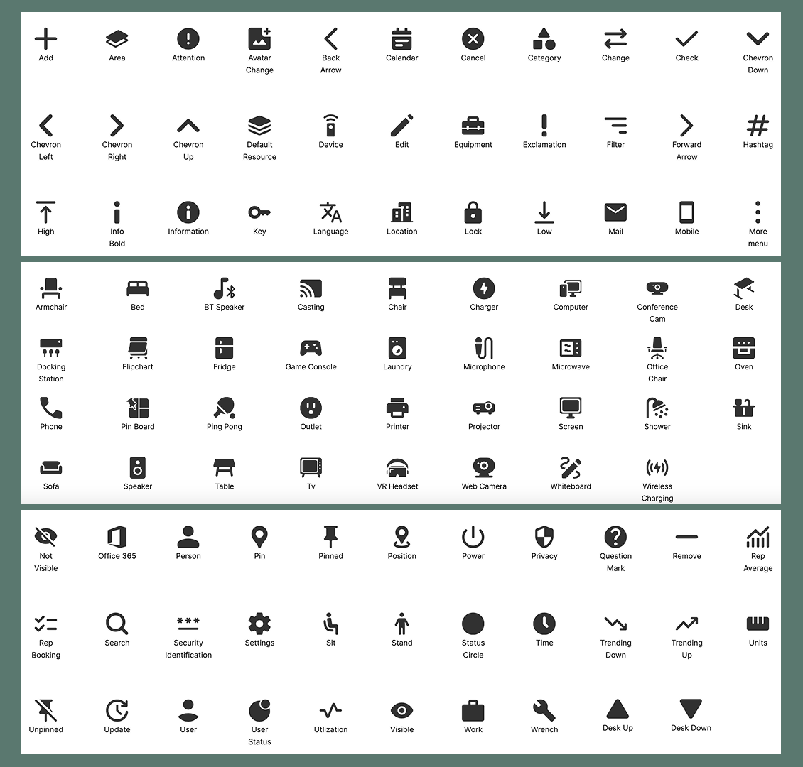
Unifying the Icon Style
The previous icon set mixed different visual styles. Together with two other designers, we redesigned 138 icons with a more consistent, rounded, and thicker style.
Key UI Improvements & Design Decisions
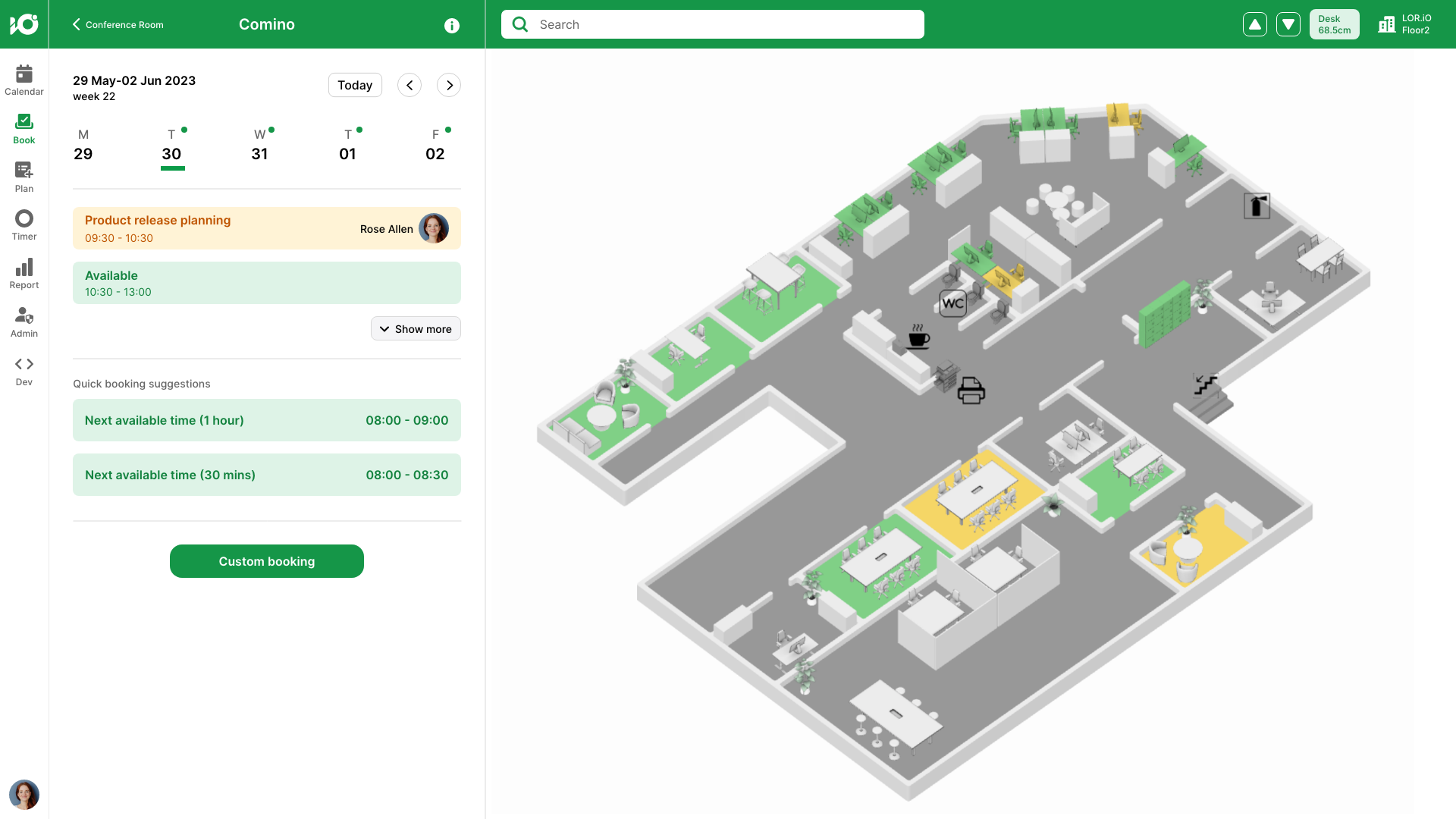
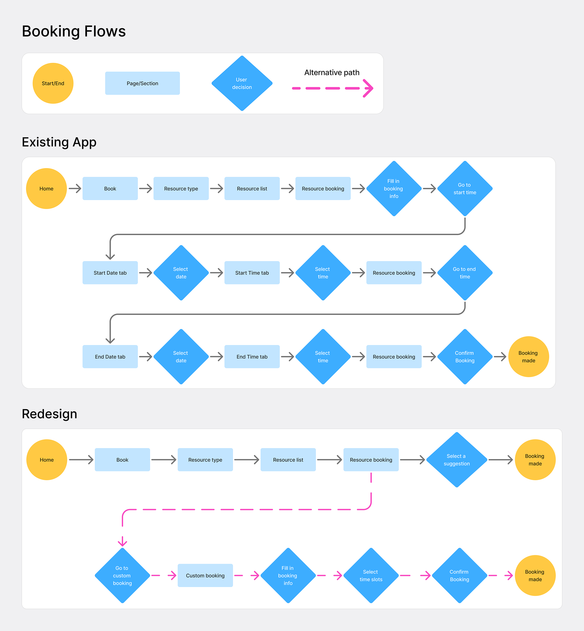
1. Faster Bookings with Quick Time Suggestions
The existing flow required too many steps—especially when selecting a time. I introduced quick booking suggestions, offering the two most common durations for that resource. This reduced booking time by 35%.
Future enhancements could include AI-powered suggestions based on the user’s history (“same as last time”).
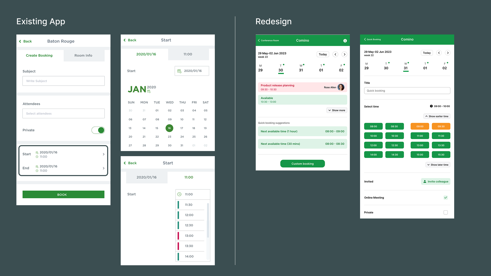
2. Always-Visible Location Information
Location details were previously hidden and often truncated. In the redesign, the top app bar always displays clear location and floor information.
To support navigation:
A new location panel opens from the right side.
Other panels (booking, calendar, settings) appear on the left.
This allows users to switch floors without interrupting ongoing tasks.

3. Search at the Center of the Experience
Users frequently search for a resource or colleague. The search bar is now placed prominently in the top bar, and the results are grouped into clear categories. "Top hits" highlight the user's recent searches.
Selecting a resource in the search results:
zooms the map to the resource’s location
opens the corresponding booking view
Selecting a colleague in the search results shows the resource status booked by that colleague (not their live location), respecting privacy.

Clicking a resource in the search results opens the booking view for that resource.

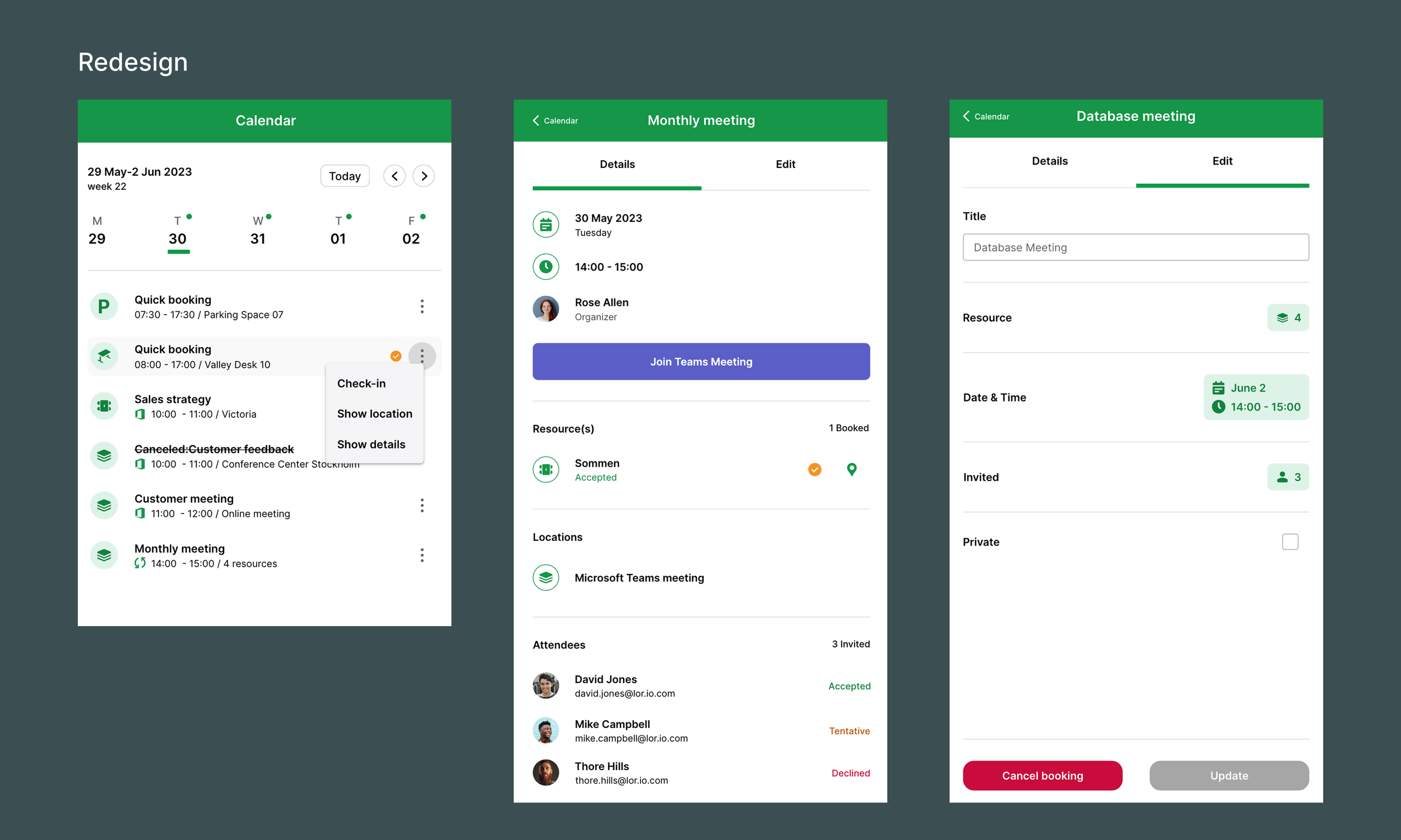
4. Clearer Daily Booking Overview
The original infinite scroll made it difficult to distinguish today’s bookings from past or future ones.
I redesigned the calendar with:
A weekly navigation
Today's bookings shown by default
Badges indicating which days have bookings
This lets users understand their week at a glance.

5. Faster Booking Management
Editing bookings previously felt cluttered because it displayed every detail at once.
I redesigned the flow so that:
Only core information is shown by default
Tapping each element opens a dedicated detail screen
Quick actions are available directly from the calendar
This significantly improved clarity and efficiency.

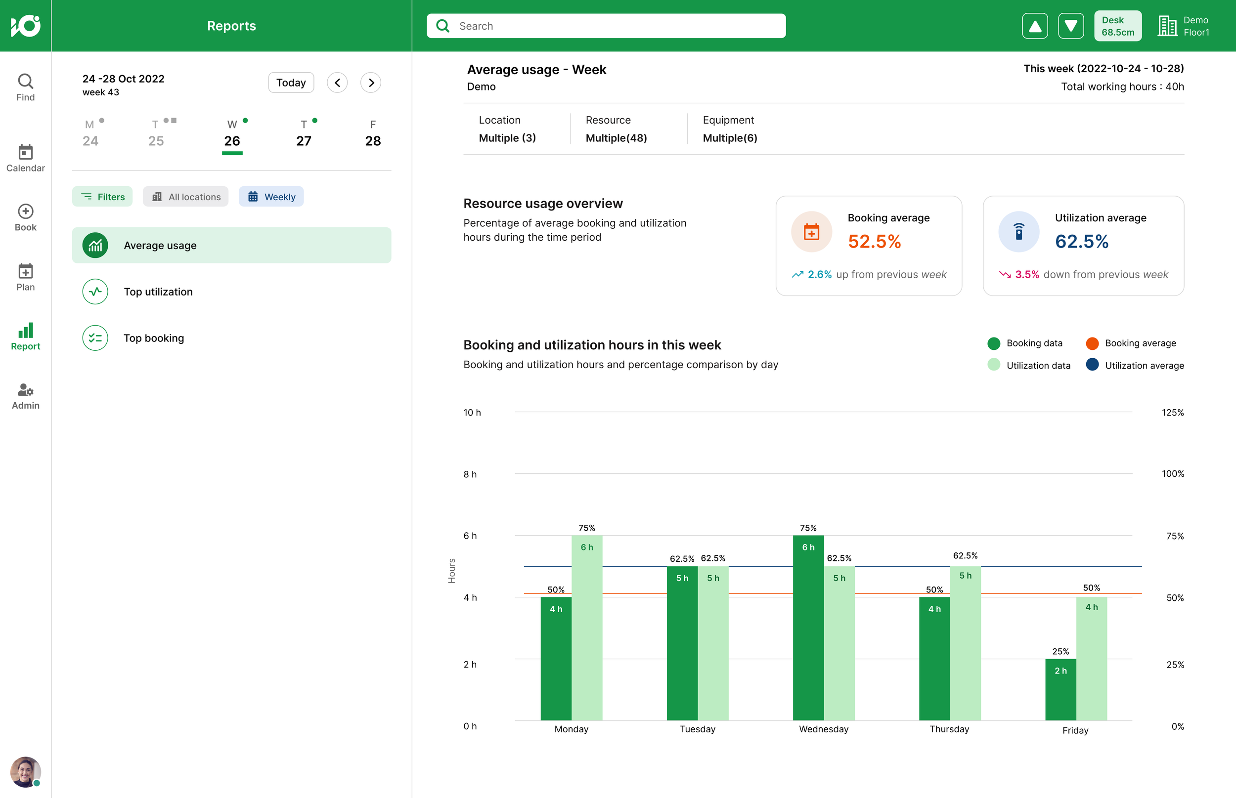
Office usage dashboard (Power BI report)
As the demand for an office-usage overview increased, I collaborated closely with Sales and Customer Relations to define clear requirements for the new feature.
Requirements
A weekly report showing the average usage of office resources
A list of the top 5 most utilized or booked resources
Filtering options so customers can view usage for specific resource types or individual resources
With these requirements in place, I began designing the user flows—ensuring the dashboard behavior aligned with how users navigate and interact with the rest of the application. After multiple design reviews and iterations, I delivered the final design. Below are the selected UIs.


Impact
Higher customer satisfaction: Users appreciated the clearer color system and fresher visual tone.
35% faster bookings: Thanks to quick-booking suggestions.
Improved market appeal: Updates contributed to attracting new customers.
What I learned
This was my first project with a large, active user base. Receiving live feedback taught me how to iterate quickly and design with real user behavior in mind.
Working on a redesign was also rewarding—keeping what already worked, identifying where flows could be improved, and extending the product in a way that felt both familiar and better for users.
Additionally, designing a large icon set gave me hands-on experience with visual consistency, grid systems, stroke weights, and the full production workflow.